You are using an out of date browser. It may not display this or other websites correctly.
You should upgrade or use an alternative browser.
You should upgrade or use an alternative browser.
TRF's Sig Hut
- Thread starter TRF
- Start date


Rano
Legend
- Joined
- Aug 20, 2010
- Messages
- 135
- Reaction score
- 13
- Points
- 55
No comments yet?
Well I see you like the sharpen tool a lot. It's good to have sharper sigs but you can also overdo it. Then there are some basic errors.
But generally I like your sigs a lot. Especially the first Gorillaz sig is really good.
And I see you just joined. Welcome
Well I see you like the sharpen tool a lot. It's good to have sharper sigs but you can also overdo it. Then there are some basic errors.
But generally I like your sigs a lot. Especially the first Gorillaz sig is really good.
And I see you just joined. Welcome
Rano
Legend
- Joined
- Aug 20, 2010
- Messages
- 135
- Reaction score
- 13
- Points
- 55
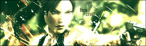
The edge mirrors sig. The placing of the render it looks like her arms are cut off if you would have put it a little more down you wouldn't have seen that part. And background choice isn't all to well a dark one would have been better I guess.
And the basketball sig there the render is of bad quality which mostly automatically ruins a sig.")
And the basketball sig there the render is of bad quality which mostly automatically ruins a sig.
- Joined
- Jan 6, 2007
- Messages
- 5,326
- Reaction score
- 1,396
- Points
- 315
so, why is it a hut?
with that kind of work it should be a twin at least, if not a house.
quit being so modest. :ermm:
that second gorillaz one is my favorite. i much prefer cartoony or 2D backgrounds.
with that kind of work it should be a twin at least, if not a house.
quit being so modest. :ermm:
that second gorillaz one is my favorite. i much prefer cartoony or 2D backgrounds.
TRF
The Original Sparrow
- Joined
- Oct 31, 2010
- Messages
- 80
- Reaction score
- 16
- Points
- 35
- Age
- 29
Alright, thanks, I'll keep those tips in mind.The edge mirrors sig. The placing of the render it looks like her arms are cut off if you would have put it a little more down you wouldn't have seen that part. And background choice isn't all to well a dark one would have been better I guess.
And the basketball sig there the render is of bad quality which mostly automatically ruins a sig.
- Joined
- Feb 8, 2007
- Messages
- 4,897
- Reaction score
- 2,389
- Points
- 305
I too like the 2nd Gorillaz signature, its definitely basic but it does work. Your signatures lack depth mainly, I can see you were going somewhere with the Kobe Bryant sig as well, but it lacks depth, blending, there's a bit of flow going on in there but it could use more work.
It helps to use color combinations that work well with each other, as well as using the original colors of your render/focal point for other areas of the signature to help blend it overall.
It helps to use color combinations that work well with each other, as well as using the original colors of your render/focal point for other areas of the signature to help blend it overall.