Necromancer
Pokémon Master
- Joined
- Aug 1, 2009
- Messages
- 4,144
- Reaction score
- 533
- Points
- 295
- Age
- 32
My Entry:

CheezMcNASTY's Entry:

D3m190d's Entry:

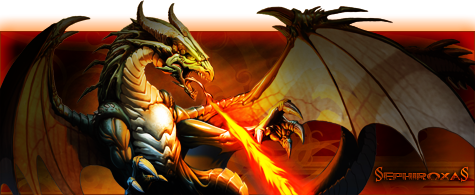
§ephiroxa§' Entry:

CheezMcNASTY's Entry:
D3m190d's Entry:
§ephiroxa§' Entry:


")