A
Ashta
Guest
Photoshop painting tutorial (WARNING: a lot of pics and text!)
Not long ago I promised to make a tutorial on creating one of my works. Well, here it is ^_^
Also it’s my first tut ever, so it is a little messy. And again (though I know some people there won’t agree) – I apologize for the lack of proper technigue and skill. I know that some of you draw even worse, but it’s not you I compare myself with
The making of “The High Priest of Darkness”
It all began with a loose doodle, and I never intended to make something serious, but Ashta was carried away (as often happens to her ). I decided to paint Cariaha, the High Priest of the Dark Goddess Theyne (Theyne is the main heroine in the fantasy novel I’m writing... or, rather, trying to begin writing
  ). Everything was done using Photoshop CS and Genius tablet.
It’s not really a big difference between using a graphic pad and a mouse. With a tablet you can draw sketches right in Photoshop (or whatever program you’re used to), and it’s much easier to blend colors or to paint hair and fur, but, for example, I learned to draw digitally with a mouse, being far away from home and my own computer, and began to use the tablet only half a year later.
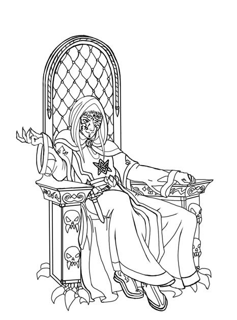
First of all I created a new layer (never paint on the background, unless it is a speedart or something) and drew the contour, using a 3-pixel sharp-edged brush – I’m trying to paint without outline, but it usually makes my job easier. Tattoos on his face were drawn on separate layer, because I was going to color them. Both layers were locked:
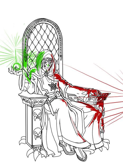
I decided the room he’s in will have two main light sources – one orange from the unseen firelight on the right, and one green, a spell emanating from his palm. It’s VERY important to establish the right light source, because otherwise the painting will look dull and unrealistic. I’m usually having problems with this :blush: , so I made another layer to show how the light will distribute:
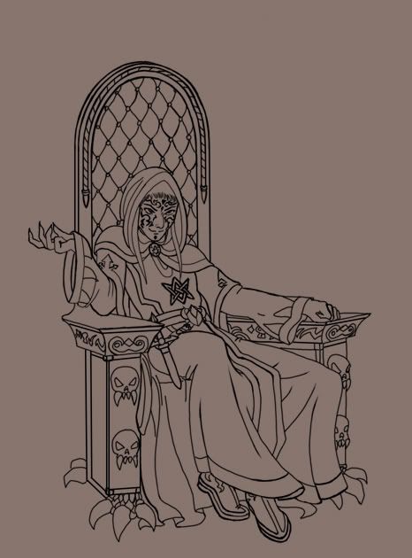
I traditionally begin with painting background, since it’s much easier to pick the right colors for the face and clothes afterwards.
Blocking in basic background color:
I put some gradient on above, and also made the wall slightly darker, because vertical surfaces such as walls, etc are usually darker than horisontal ones.
Establishing stones shape:
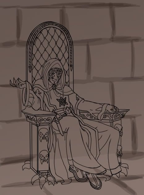
Using a broad sharp-edged brush with about 18% opacity, I painted in both light reflections, added basic shadows and also decided to make a little orange light from the left:
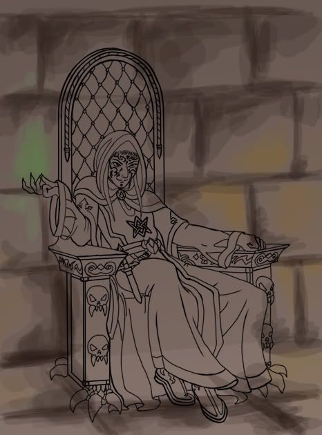
A common mistake most of the beginners make is that they paint shadows the same hue the basic color is, only darker. Remember, SHADOWS ARE NOT GREY! Their color is always more saturated than the color or the object. Light distributes differently, and the closer to its source the object is, the darker and sharper the shadows are.
Now the fun starts If you are the beginner going to make realistic paintings, the next importang thing to remember (yes, I can be kinda controlling sometimes
  ), is that an object can have several different colors and hues. It depends, as always, on the light and surrounding. Everything reflects and is reflected, even wood or paper. It’s just our brain that doesn’t usually register unimportant colors, but if you look closely, you’ll see, that, for example, the skin of an arm under a red sleeve has a slightly reddish hue.
The same works here. I darken the shadows and lighten highlights using the greenish and bluish hues around the supposed spellfire and reddish and yellowish – around the orange light sources. I also begin to blend the colors, using the eyedropper to pick them from the painting. To make the stones look more realistic I created another layer, filled it with a dark brown stone wall texture, using a 20% opacity brush, and added several thin cracks:
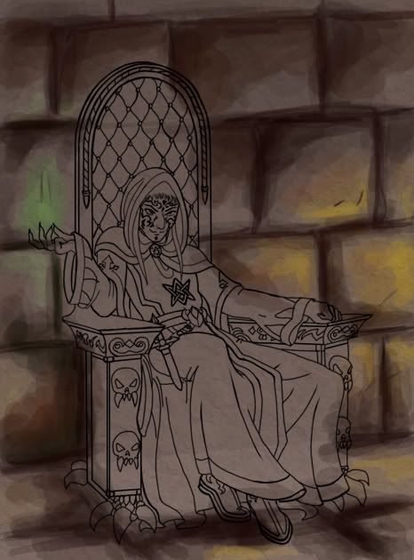
Finishing off the background, darkening it even more and correcting our mistakes (I made a whole lot again, so I won’t write about each one of them):
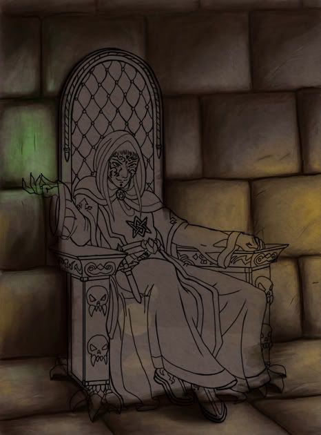
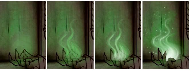
The spell itself is easy – I marked its location with a green soft-edged brush, then painted the fire with a brighter green color and its center with very light green hue. Also I added several sparks:

Not long ago I promised to make a tutorial on creating one of my works. Well, here it is ^_^
Also it’s my first tut ever, so it is a little messy. And again (though I know some people there won’t agree) – I apologize for the lack of proper technigue and skill. I know that some of you draw even worse, but it’s not you I compare myself with
The making of “The High Priest of Darkness”
It all began with a loose doodle, and I never intended to make something serious, but Ashta was carried away (as often happens to her
It’s not really a big difference between using a graphic pad and a mouse. With a tablet you can draw sketches right in Photoshop (or whatever program you’re used to), and it’s much easier to blend colors or to paint hair and fur, but, for example, I learned to draw digitally with a mouse, being far away from home and my own computer, and began to use the tablet only half a year later.
First of all I created a new layer (never paint on the background, unless it is a speedart or something) and drew the contour, using a 3-pixel sharp-edged brush – I’m trying to paint without outline, but it usually makes my job easier. Tattoos on his face were drawn on separate layer, because I was going to color them. Both layers were locked:

I decided the room he’s in will have two main light sources – one orange from the unseen firelight on the right, and one green, a spell emanating from his palm. It’s VERY important to establish the right light source, because otherwise the painting will look dull and unrealistic. I’m usually having problems with this :blush: , so I made another layer to show how the light will distribute:

I traditionally begin with painting background, since it’s much easier to pick the right colors for the face and clothes afterwards.
Blocking in basic background color:

I put some gradient on above, and also made the wall slightly darker, because vertical surfaces such as walls, etc are usually darker than horisontal ones.
Establishing stones shape:

Using a broad sharp-edged brush with about 18% opacity, I painted in both light reflections, added basic shadows and also decided to make a little orange light from the left:

A common mistake most of the beginners make is that they paint shadows the same hue the basic color is, only darker. Remember, SHADOWS ARE NOT GREY! Their color is always more saturated than the color or the object. Light distributes differently, and the closer to its source the object is, the darker and sharper the shadows are.
Now the fun starts
The same works here. I darken the shadows and lighten highlights using the greenish and bluish hues around the supposed spellfire and reddish and yellowish – around the orange light sources. I also begin to blend the colors, using the eyedropper to pick them from the painting. To make the stones look more realistic I created another layer, filled it with a dark brown stone wall texture, using a 20% opacity brush, and added several thin cracks:

Finishing off the background, darkening it even more and correcting our mistakes (I made a whole lot again, so I won’t write about each one of them):

The spell itself is easy – I marked its location with a green soft-edged brush, then painted the fire with a brighter green color and its center with very light green hue. Also I added several sparks:
